Dark Mode UX : Tips, Challenges & Best Practices
FastCreaSite – The rise of dark mode across digital platforms has reshaped how designers approach user experience. From mobile apps to complex web interfaces, Dark Mode UX: Tips, Challenges & Best Practices is a topic every designer and developer should understand. Beyond aesthetics, it’s about readability, comfort, and accessibility creating digital experiences that look beautiful while staying functional in every light condition.
Dark mode started as a visual preference but quickly evolved into a UX standard. Many users prefer darker interfaces because they reduce glare, save battery life, and create a sleek, modern look. With OLED and AMOLED screens becoming mainstream, black pixels now literally consume less power. But beyond technical efficiency, dark mode delivers psychological comfort — users feel more focused and less strained, especially in low-light environments.
Before jumping into design, you must understand when and why users prefer dark mode. Research shows people often enable it during the evening or when reading for long periods. It’s not just about color preference it’s contextual behavior. A Dark Mode UX should adjust seamlessly to the time of day or environmental brightness, enhancing comfort without requiring manual toggles.
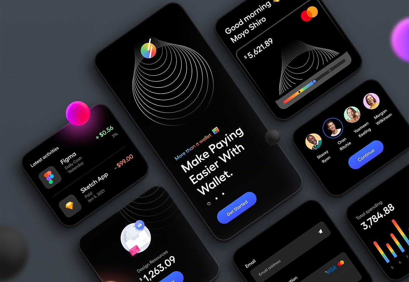
Designing for dark mode is not as simple as inverting colors. The human eye perceives contrast differently in dark environments. Absolute black (#000000) might create harsh edges and strain the eyes, while soft dark grays (#121212 or #1E1E1E) create better readability. Accent colors should remain vibrant but not blinding. The goal is contrast balance — ensuring text, icons, and backgrounds coexist without overwhelming each other.
Readability is one of the biggest challenges in Dark Mode UX. White text on a pure black background can cause halos or visual fatigue. Instead, designers use slightly off-white typography (#E0E0E0 or #F1F1F1) to soften edges. Also, remember accessibility standards like WCAG 2.1 maintain at least a 4.5:1 contrast ratio for body text. Always test your interface with visually impaired users or simulation tools to ensure inclusivity.
Images can break a dark interface if not adjusted correctly. Bright backgrounds in photos or icons can clash with the surrounding UI. One trick is to use transparent PNGs or muted background overlays to harmonize visuals. Subtle shadows are essential to create depth, especially in flat design systems. A Dark Mode UX without shadows can appear lifeless or confusing when layering elements.
Modern apps must support both light and dark themes dynamically. That means building a scalable system where UI elements adapt instantly. For example, buttons, cards, and modals should share the same token system for color and contrast. This makes theme switching seamless for the user. Many design systems now use CSS variables or React theme providers to implement this flexibility.
Typography plays a crucial role in usability. Thin fonts that look elegant in light mode can vanish in dark environments. Use medium to bold weights for primary text and ensure adequate spacing. Avoid saturated hues like neon green or cyan for body text they can strain the eyes against a dark background. A Dark Mode UX thrives on balance: visual comfort over unnecessary decoration.
Designers often overlook how different screens render dark mode. Colors may appear cooler on one device and warmer on another. Testing under various lighting conditions — from bright sunlight to total darkness helps ensure consistent quality. Tools like Figma’s dark mode preview or Chrome DevTools’ simulation mode can identify readability issues before launch.
Dark mode isn’t just a design decision; it’s a performance feature too. Use CSS media queries like prefers-color-scheme to automatically detect system preferences. For web apps, ensure that transitions between themes don’t flicker or reload the page. Lightweight code and optimized assets enhance responsiveness, a crucial part of Dark Mode UX best practices.
Common pitfalls include using pure black backgrounds, ignoring accessibility standards, and failing to adjust secondary UI elements. Others forget to modify system notifications or third-party plugins that clash with the dark environment. Every part of your interface even scrollbars and pop-ups should blend naturally into the dark aesthetic.
Why do users prefer dark mode?
Because it reduces eye strain, conserves battery life, and feels modern and immersive.
Should every app offer dark mode?
Yes, especially if it involves long reading or frequent use at night. It improves engagement and comfort.
Is dark mode better for accessibility?
Not always — some users with astigmatism find dark backgrounds harder to read. Offering both themes is ideal.
Does dark mode save battery on all devices?
Only on OLED or AMOLED screens, where black pixels require less energy.
How can I test my dark mode effectively?
Use real devices in various environments and follow contrast accessibility guidelines.
[SITE_NAME] - The rise of micro interactions has become a pivotal trend in UX design, offering users subtle feedback that…
[SITE_NAME] - companies increasingly rely on deep UX insights platforms to better understand user behavior and improve online experiences. In…
FastCreaSite - Web Development & Digital Solutions - Design teams increasingly adopt AI component generation Figma features to speed up…
FastCreaSite - Web Development & Digital Solutions - accessibility testing tools inclusive web designers rely on have become vital for…
FastCreaSite - Web Development & Digital Solutions - rapid prototyping tools UX teams adopt in 2026 are revolutionizing how user…
FastCreaSite - Web Development & Digital Solutions - The rise of jamstack technology is reshaping the way developers build websites…