Web Development – In the digital age, a website is more than just an online presenceit’s a reflection of a brand’s identity, values, and professionalism. Whether for a small business, creative portfolio, or global corporation, web design plays a crucial role in shaping how users perceive and interact with digital content.
Behind every visually stunning and functional website lies a thoughtful combination of layout, color, and typography. These three elements form the foundation of good web design, influencing not only the look and feel of a website but also its usability and emotional impact. This article explores how these design components work together to create cohesive, engaging, and user-friendly web experiences.
Web design is the art and science of creating the visual and interactive aspects of a website. It encompasses everything from structure and navigation to aesthetics and accessibility. Unlike web development, which focuses on coding and functionality, web design emphasizes user experience (UX) and user interface (UI) how the website looks, feels, and flows.
Modern web design is not just about making something attractive. It’s about creating a balance between beauty and usability. A well-designed website captures attention within seconds, communicates information clearly, and encourages visitors to take meaningful actions — whether making a purchase, reading an article, or filling out a contact form.
To achieve that, designers rely on three core pillars: layout, color, and typography.
A website’s layout determines how information is organized and presented on the screen. It guides the user’s eyes, establishes hierarchy, and ensures that key elements — such as navigation menus, buttons, and calls-to-action (CTAs) — are placed intuitively.
A good layout helps users find what they need quickly and easily. Studies show that people form an impression of a website in less than one second, meaning structure matters as much as visuals.
Most web designers use a grid system — an invisible framework that helps maintain alignment and consistency across a website. Grids ensure that elements like images, text, and icons are evenly spaced, making the design more organized and pleasing to the eye.
The 12-column grid, popularized by frameworks like Bootstrap, remains the standard in responsive design. It allows designers to create flexible layouts that adjust gracefully across devices, from desktop monitors to smartphones.
White space, also known as negative space, is the unmarked area between design elements. It might seem like “empty” space, but it’s a powerful tool that enhances readability and focus.
By giving content room to breathe, white space prevents visual clutter and improves comprehension. Think of it as a pause between sentences it helps the viewer process what they’re seeing.
Different website goals call for different layout structures:
F-Layout – Mimics natural reading patterns, ideal for news and blogs.
Z-Layout – Creates visual momentum, perfect for landing pages.
Single-Page Layout – Encourages storytelling through scrolling.
Grid-Based Layout – Highlights multiple pieces of content simultaneously, great for portfolios or e-commerce.
Each type influences user behavior differently. The key is selecting one that aligns with the website’s purpose and content strategy.
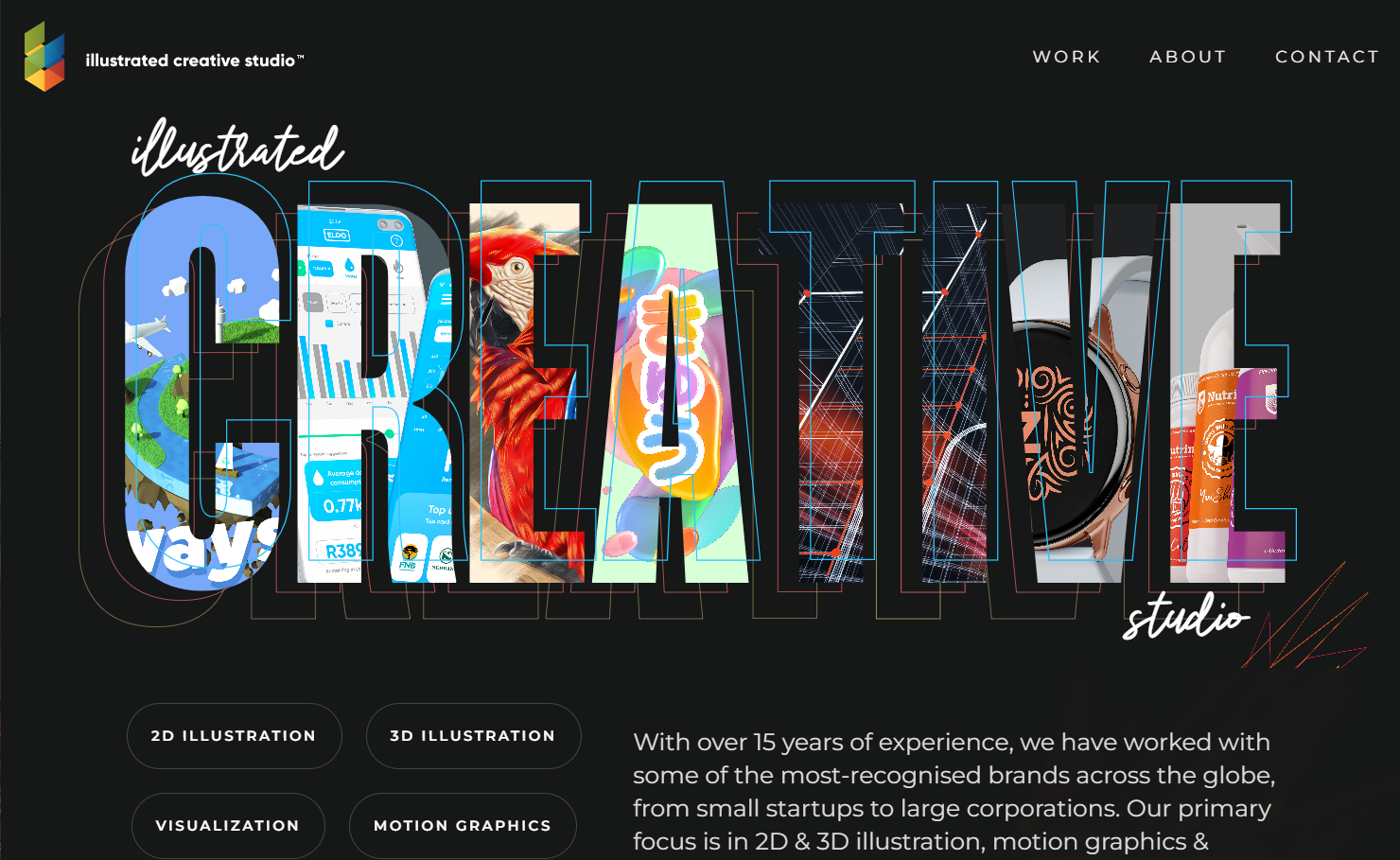
Color is more than decoration it’s communication. The right color scheme evokes emotion, strengthens brand identity, and directs attention. In web design, color psychology plays a significant role in how users feel and react.
Each color carries psychological associations that designers can harness:
Blue – Trust, stability, and calmness. Common for corporate or financial websites.
Red – Energy, passion, and urgency. Often used for sales or alerts.
Green – Growth, balance, and nature. Favored by wellness and sustainability brands.
Yellow – Optimism, creativity, and warmth. Works well for youthful or energetic sites.
Black and White – Sophistication, simplicity, and clarity. Ideal for luxury or minimalist designs.
By understanding color meanings, designers can craft experiences that resonate emotionally with the audience.
A brand’s color palette is central to recognition. Think of Coca-Cola red, Facebook blue, or Spotify green — each evokes a clear visual identity.
When designing a website, consistency is essential. The chosen colors should reflect the brand’s personality and appear consistently across buttons, icons, backgrounds, and typography.
While vibrant colors can attract attention, contrast ensures legibility. For example, dark text on a light background (or vice versa) is easier to read. Accessibility standards, such as the Web Content Accessibility Guidelines (WCAG), emphasize sufficient color contrast for users with visual impairments.
Designers also use contrast to create visual hierarchy. Bright or bold colors naturally draw attention to CTAs or key messages, guiding users through the intended flow of interaction.
Recent years have seen a shift toward bold gradients, dark mode interfaces, and pastel aesthetics. These trends reflect changing user preferences for visual comfort and modern appeal.
However, timeless design doesn’t rely on trends alone it blends modern techniques with enduring principles of harmony and readability.
Typography is often underestimated, but it’s one of the most expressive tools in web design. The choice of fonts, spacing, and text arrangement can determine how content feels and how easily it can be consumed.
Fonts convey tone and personality. A luxury brand might choose a sleek serif typeface, while a tech startup might favor a geometric sans-serif.
There are three main font categories to consider:
Serif fonts (like Times New Roman or Georgia) – convey tradition and authority.
Sans-serif fonts (like Helvetica or Roboto) – suggest modernity and clarity.
Display or decorative fonts – add uniqueness but should be used sparingly.
The key is to maintain readability while matching the website’s character. Overly ornate fonts might look attractive but can tire the eyes quickly.
Typography establishes visual hierarchy, helping users distinguish between headlines, subheadings, and body text. Using different sizes, weights, and colors helps organize content and guide readers naturally through the page.
Common structure examples include:
H1 – Page title or main headline (largest and boldest).
H2/H3 – Subheadings that divide content logically.
Body text – Typically 16–18px in size for readability.
Line height and spacing also matter. Ample spacing improves comfort, especially for longer articles or blog posts.
Like color, typography strengthens brand identity. Many brands create custom font families to ensure consistent tone across digital and print materials.
When done right, typography becomes invisible it doesn’t draw attention to itself but enhances the message. Poor typography, on the other hand, can break a user’s trust or make a website appear amateurish.
With advances in web technology, designers now have access to thousands of web-safe fonts through platforms like Google Fonts and Adobe Fonts. Modern trends include:
Variable fonts for flexible weights and styles.
Minimalist sans-serifs for clean, modern looks.
Retro and serif revivals for nostalgic appeal.
Animated or kinetic typography to add motion and interactivity.
Typography has evolved beyond static letters it’s now an interactive design element.
While each design element holds individual power, their real strength lies in harmony. A beautiful website emerges when layout, color, and typography work together cohesively.
For example:
A structured grid layout provides order.
A balanced color palette adds emotion and energy.
Clear, legible typography ensures the message is received.
Good design feels natural users shouldn’t have to “think” about where to click or what to read next. Every visual decision should serve a purpose: enhancing usability, guiding attention, or evoking emotion.
Modern web design must also consider responsiveness how layouts, colors, and typography adapt to different devices. A design that looks perfect on a large monitor may fail on a smartphone if not properly optimized.
Responsive design principles ensure:
Text remains readable without zooming.
Buttons and menus are easy to tap.
Images and layouts scale proportionally.
With mobile users now representing more than half of global web traffic, adaptability is no longer optional — it’s essential.
At its core, web design is about people. Beyond visual appeal, it must engage emotions and create meaningful experiences. Subtle animations, warm color tones, or a carefully chosen font can evoke trust, curiosity, or joy.
Good design doesn’t shout; it communicates clearly. It makes users feel comfortable, understood, and in control. That emotional connection often determines whether a visitor stays or leaves.
Building beautiful websites is both an art and a science. Layout organizes content, color adds emotion, and typography gives voice to the message. Together, they create digital experiences that are visually captivating and intuitively functional.
In today’s competitive digital landscape, design is not a luxury it’s a necessity. A well-designed website builds credibility, enhances user engagement, and ultimately drives success.
By understanding and mastering the principles of layout, color, and typography, designers can transform ordinary websites into powerful expressions of creativity and brand identity turning the web into a canvas where beauty meets purpose.
FastCreaSite - The web development industry continues to evolve rapidly with new trends and innovative digital solutions emerging this year.…
FastCreaSite - Web Development & Digital Solutions - Fastcreasite web development modern offers innovative solutions designed to improve your business’s…
FastCreaSite - Enhancing digital platforms requires a deep understanding of web design and UX to boost user retention effectively. The…
FastCreaSite - Expert web dev ux strategies combine cutting-edge development and intuitive design to elevate your website’s appeal and functionality…
FastCreaSite|Tech News & Trends - Web development solutions have become key to helping businesses strengthen their online presence and compete…
FastCreaSite - Web Development & Digital Solutions - FastCreaSite seo website optimization helps businesses build websites that are faster, SEO-friendly,…